LAYS MAXX KV
Client
LAYS MAXX KV
Year
2024
Services
GRAPHIC DESIGN
Stack
- Key Visual
- Packshot
- Art Direction
Context
THE CHALLENGE
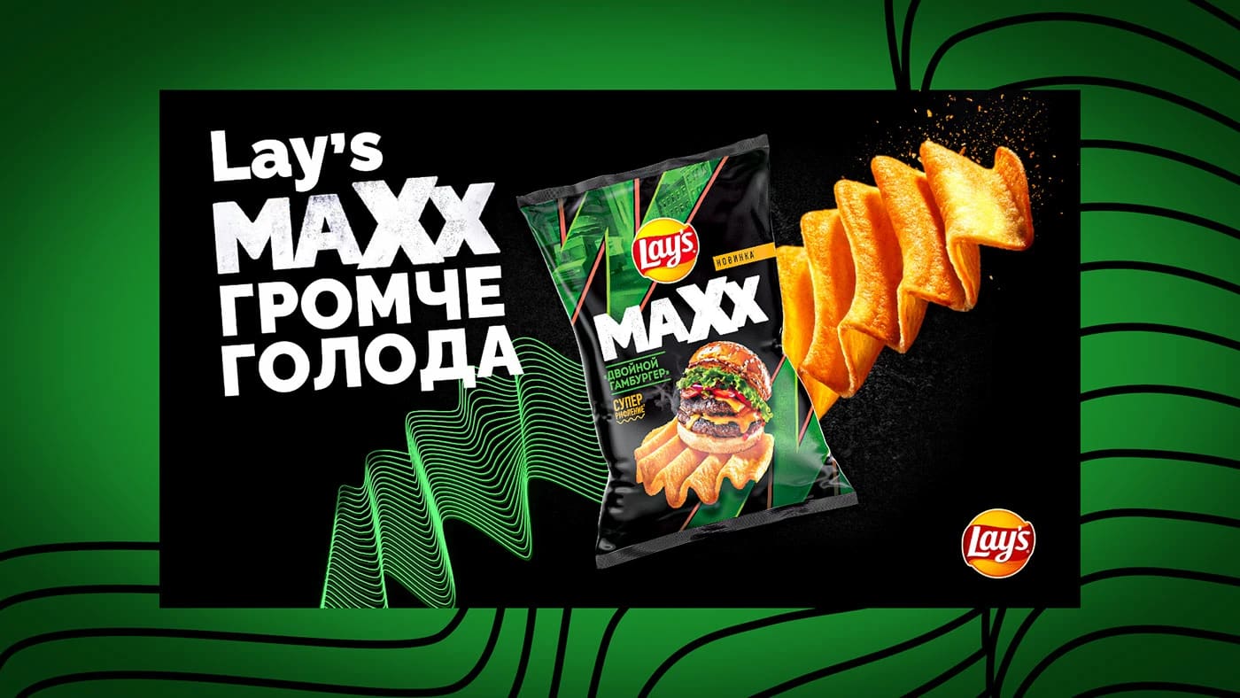
Announce the launch of extra-ridged Lay's MAXX so the visual conveys not flavour but loudness — the range's core promise.
Solution
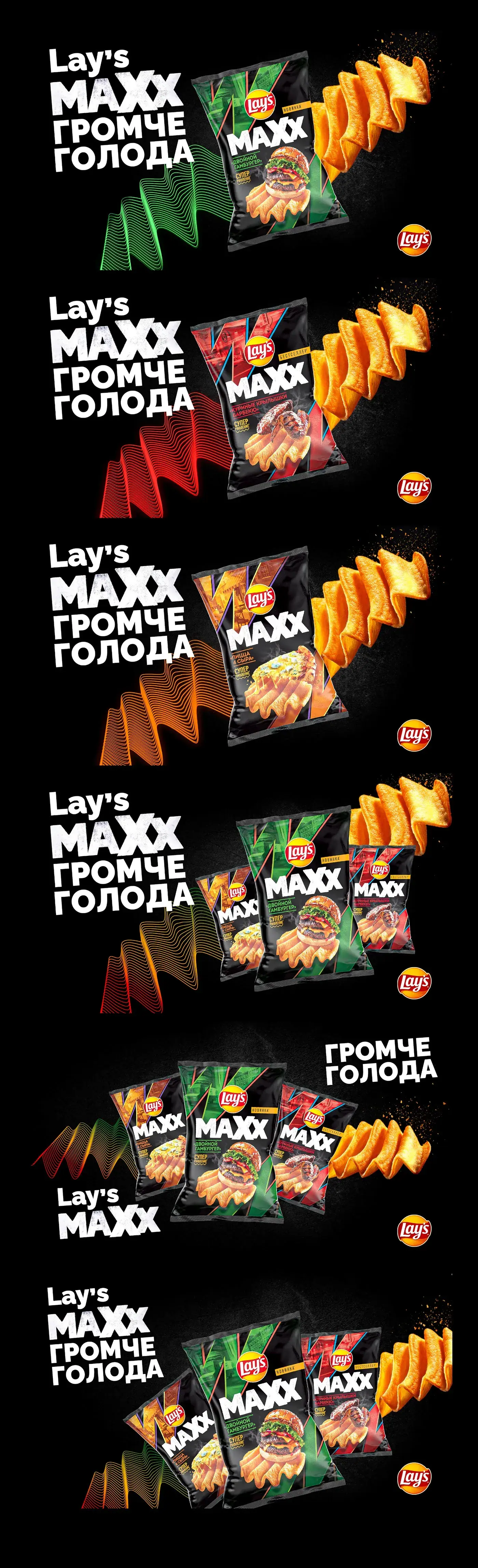
We took the line «Louder than hunger» literally: sound waves built from thin green lines run across the frame while oversized ridged crisps fly out of the pack trailing seasoning. A black-and-green palette separates MAXX from the core range, and the Double Burger packshot holds the centre of the composition.

Project details
Decision breakdown
What another project can reuse
The loudness promise is translated into waves, product movement and a dark high-contrast palette. Flavor stays readable on pack while the scene sells the line character.
A launch becomes easier to adapt when background, type and movement all express one product property.
Discuss a similar project
Want the same?
Leave your phone number and we will contact you about a project for Uzbekistan, Russia, or Belarus.
More in this category

Next case