BRANDING
REBRENDING LOGOTIPA
Client
REBRENDING LOGOTIPA
Year
2019
Services
BRANDING
Stack
- Branding
- Logo Design
- Art Direction
Context
THE CHALLENGE
Rebrand a mark so the new version reads as an evolution of the old one rather than a swap for someone else's symbol.
Solution
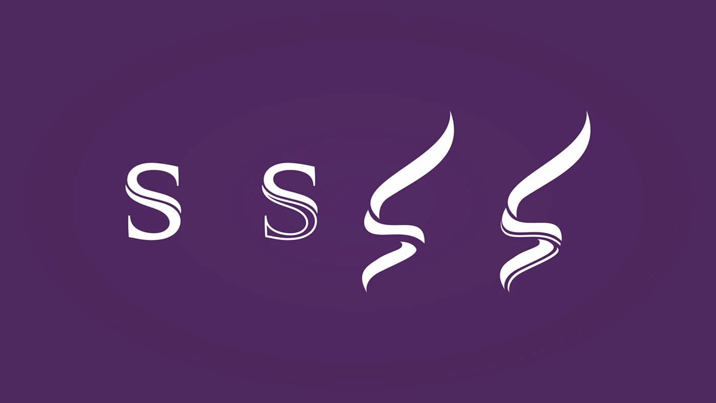
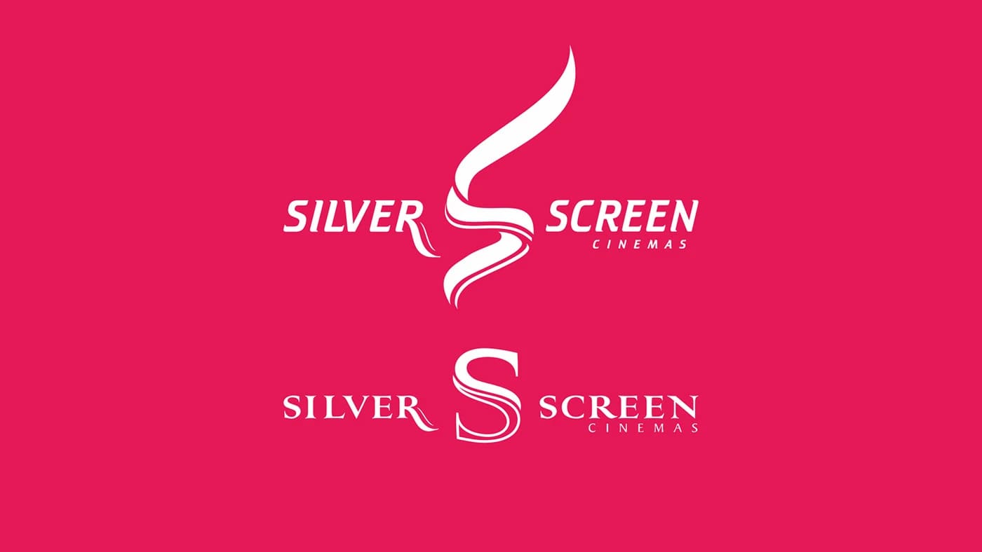
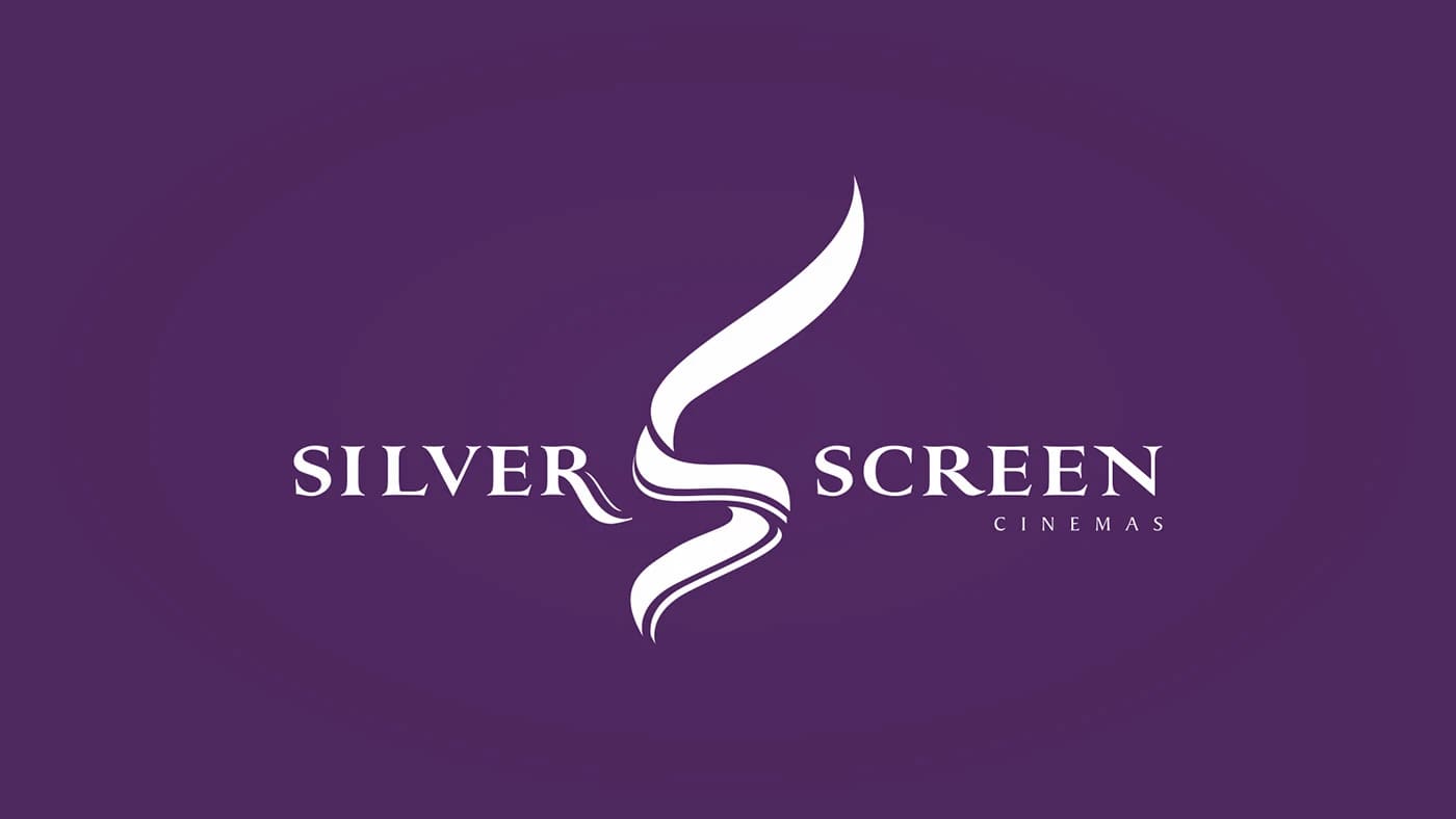
We laid the transition out in four steps: from a classic serif S with a flourish to a calligraphic line where the letter keeps its angle and pivot but loses literalness. The final mark works as an abstract symbol — recognisable at small sizes without a wordmark — while the intermediate stages make the logic of the shift legible in review.
Impact & metrics
BrandingFormat
BrandingCategory
Discuss a similar project
Want the same?
Leave your phone number and we will contact you about a project for Uzbekistan, Russia, or Belarus.


Next case
KV PODAROCHNYE KARTYView case study